You want to log in? No problem!
Put in your email, press enter.
We’re not asking for your password at the same time, because we hate password managers. Everyone knows you’ve memorized them, or use the same one, or whatever.
Oh, wait, we don’t want your password!
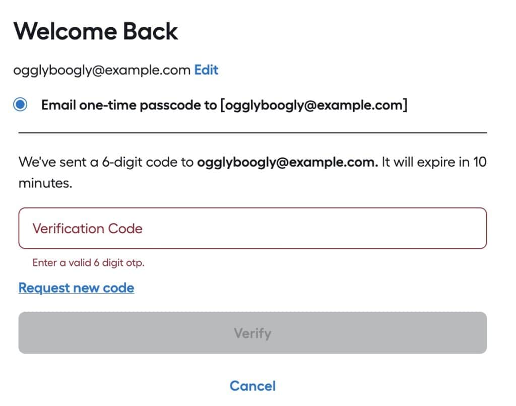
We’ll email a code and you have TEN MINUTES to type it in! What’s the problem?
The “Problem”
The reason why one would set an expiration time on a verification email is so the verification can’t be intercepted after the fact and used to log in.
For example, if a user tried to log in and forgot to check their email, someone later could look at their email, find the verification message and use it to log into the user’s account. That’s fine.
In the above case, the developers are expecting a user’s account to be SO COMPROMISED, they can’t afford to leave it exposed for more than 10 minutes!
Email is slow
Well, not slow, but not guaranteed to be there instantly.

Emails from a sender to a receiver have to pass through one or more relays–and those relays can delay transmission for seconds, minutes or hours. One potential issue is if a transmission between two relay nodes must be resent due to errors.
An email sent to your neighbor can potentially take longer than one sent to a friend in another country; it all depends upon the speeds of transmission and delay between notes.
Options
There are several alternatives to using a verification email with a 10 minute expiration, that have less of a burden upon the end user and still provide security. Relying upon a user’s email account is risky, as that is one of the prime goals of attackers: take over a user’s email account and you can gain access to most of all their accounts on other services via the “forgot password” action.
Good
First, don’t set the email expiration time too soon. If you set it to expire in an hour, that is a good compromise between leaving the login ‘exposed’ and giving the user a reasonable time to receive the email and use it.
Once the code/link/token in the email is used it should become invalidated so it can’t be used again. This will vastly reduce the danger of a bad actor somehow gaining access to the verification email and thus the user’s account. They would still have to get the email and try to log onto the account before the actual user did.
Better
- Use SMS to send a validation code/token, which is more reliable as the nodes are designed for fast communication.
- Give the user an option to use a regular (long) password, or a token from an authenticator app instead of a validation email. As of 2026, passwords shorter than 11 characters are mostly useless from brute-force guessing. Using a password manager to generate longer passwords (e.g., 30 characters) is a good approach. Enforcing complexity (e.g., uppercase + number + lowercase + special character) has little bearing on security.
Best
Use passkeys.
☠️ Security Questions = PWND ☠️
Another excuse for me to say that security questions are a tell the developers aren’t skilled in securing applications, and they happen to be climbing on Mt. Stupid.

Security questions give you the opportunity to use a weak password to bypass a strong password (or passkey, authentication token, email verification, etc).