An early influence on my UI/UX interest was Jakob Nielsen at useit.com/alertbox. I devoured his articles on how people use the web, worst-practices (unfortunately far too many are still in use today), and common traps.
Learning from useIt.com, webpagesthatsuck.com and others, I grew my skills from definitely sucks to still sucks, but less. I started noticing how people use websites and how those sites are inadvertently designed to make things harder to get done. I would check in every once in a while to see the useit “state of the web” article on usability issues and successes.
A few weeks ago, I thought about the useit site and realized I hadn’t been there in quite a while—since probably before COVID—and decided to check it out. I noticed it redirected to NNGroup.com/articles. After clicking around for a bit, I tried to find the latest state of the web. I clicked on his author name on one of the old articles and it brought me to his page:
How many healthcare websites were designed by someone who knows nothing about user interface design?
A: All of them
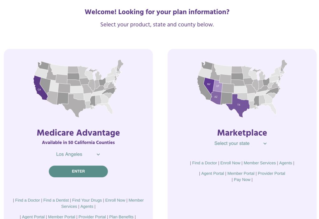
Garbage Healthcare Insurance Website
Call to action? 🤣
Let’s say you wanted to log into the member portal. Where is it?
(I cropped the header off because this particular insurance company is not special in any way; they all suck more or less the same way)
Good luck, it is in the bottom of the screen. There’s no menu, no LARGE call to action. Nothing.
In fact there’s no menu at all.
The first time I tried to find it, I skimmed until I came to “Member Services” and clicked it. WRONG!
The link for the portal is below the member services link.
What can you do?
Nothing, absolutely nothing. Except learn from these idiots’ mistakes.
Figure out what is the most-used function for your website.
For potential new customers,
a link to a plan summary that shows the difference between plans and their costs, and
links or buttons to enroll in a particular plan
For new customers, it is two or three things:
Getting an ID card,
Finding an in-network† doctor, and
possibly paying the first month’s premium (rare)forget it, no one is going to do thisunless you’re on Obamacare which was burnt and put up on blocks by the GOP.
For existing customers it is two things:
Checking balances (deductibles),
Reviewing Explanation of Benefits (EOBs),
Locating a doctor, and
Printing a new ID card
Make the most-used functions FRONT AND CENTER, with as few actions (mouse clicks, scrolls, typing) as possible.
Make it so your site does all the heavy lifting, figuring out what to place in front of the user based upon their needs.
What they did
Here’s what they’ve determined their customers are most interested in
Deciding whether they are Medicare Advantage or Obamacare patients
Then as an afterthought, at the bottom, away from everything else, in small print:
Find a doctor – will be used while a person is trying to figure out where they can go
Enroll Now – will only be used once and never again
Member Services – what the hell does that even mean? Will customers use this often or not at all?
Agents – Never used by any customer
Agent Portal – Never used by any customer
Member Portal – probably used by customers, a lot
Provider Portal – Never used by any customer
Pay Now – used by a tiny, tiny fraction of customers that don’t have job-provided insurance. Will only be used once to set up auto payment, except for that even smaller fraction of people who don’t trust autopay (probably 5 people)
Out of that whole mess, 13% (or maybe 26%) will be used by customers several times, 13% will be used once, 38% will NEVER be used, 13% will be used by a tiny fraction of customers one time (and a minuscule number more than once).
Worst case, 13% will be used by customers and 87% will not be used, yet they are almost all treated as having the same importance (for options on the second and third lines–which happens to contain the more-important options–they are slightly worse)